Tuesday, April 26, 2011
Thursday, April 14, 2011
Initial Renderings
Student Lounge Area (below)
9th grade Studio (below)
Art Lab (below)
bike rack (below)
Bus Stop and Front entrance of the School (below)
Collaborative Group Area (below)
View from the Driveway (below)
View from the balcony (below)
Overview of the Site (below)
Overview of the interior of the building
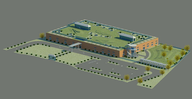
Finalized Site Plan
The site has a parking lot for 40 cars including 2 preferred parking spots, 3 handicap spots and 1 carpool spot. The green area in front of the school is made of drivable grass so it can be used as overflow parking. The roof garden on the 2nd story of the building has tiered mounds and shrubbery. The tiered effect is mimicked in the Student Courtyard.
Thursday, April 7, 2011
Wednesday, April 6, 2011
Monday, April 4, 2011
Sample Furniture Spec Sheet
I will make spec sheets for all major pieces in my building including lighting, furniture, materials, and technology integration.
Codes Compliance Diagrams
Thursday, March 31, 2011
Codes Compliance Diagram 1
This image shows the dimension of corridors, door swings, and path ways. The yellow path denotes egress and fire exits. The red circles denote the ADA 5' Handicap turning radius.
Wednesday, March 30, 2011
Thursday, March 24, 2011
Materials
These are the materials I plan on using. The carpet will be used on the hallways. The wood laminate will be used in the classrooms. I will use the gray laminate as accents underneath the skylights in each classroom. The fabric swatches on the left are for the "plus" sign benches in the student lounges. The gray and blue dots are for the stairs. The blue will highlight the nose of the tread.
Wednesday, March 23, 2011
Initial Site Design
Beginning Design of the Site Plan.
I am still trying to work out the size of turning lanes, parking access, bike lanes/storage, accessible parking placement etc. I think the first photo is the one I will use as a basis for my design. I like that the parking lot lines up with the lines of the building. I am hoping to get help from an architect to design the landscaping.
Thursday, March 17, 2011
LEED Template Revision
I felt like my LEED template was a little drab. I decided to add some color to the pages. Let me know what you think.
Sunday, March 13, 2011
ADMH Perspectives
I am not sure which perspectives I will use just yet. I plan on rendering the walls, floor and ceiling in Revit, hand rendering the furniture or "featured item" in the perspective, and then importing and tying it all together in Photoshop.
Subscribe to:
Comments (Atom)


